
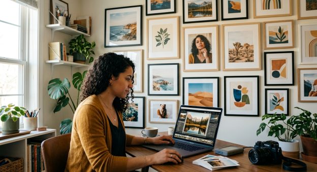
How to Edit Your Photos for a Gallery Wall with Consistent Color
Your favorite photos can look wonderful separately and slightly awkward beside each other. A beach portrait feels blue. A birthday snapshot glows yellow. A mountain scene has deep shadows that overpower everything nearby. Each image holds a memory worth keeping, but their edits tell different visual stories. Creating a cohesive gallery wall starts with helping those photographs share a mood while keeping the details that make them yours.
Your Wall’s Color Blueprint: Choose photographs that share a few colors or a compatible mood. Use one image as a reference, then adjust white balance, brightness, and contrast across the collection. Keep skin tones believable and let different lighting conditions retain their character. Plan crops around your frame openings, check the photographs side by side, and order small test prints before committing to the full arrangement. Consistency comes from careful comparison, rather than applying identical settings everywhere.
Choose Photographs That Belong in the Same Conversation
Start with more photographs than you need. If your wall has room for six frames, gather twelve or fifteen possible images. This gives you room to choose based on visual relationships instead of forcing every favorite into the arrangement.
Look beyond the subject. A portrait in a green sweater might sit comfortably beside a woodland photograph. A sandy beach can echo the warm neutrals in a family kitchen scene. Those connections help photographs from different places and years feel related.
Pay attention to the quality of the light, too. Soft window light and an overcast outdoor portrait often pair easily. Harsh midday sunlight may need more work beside a gentle indoor image. You can still combine them, but editing cannot fully change the direction or softness of the original light.
Give each photograph a reason to stay. Perhaps it carries emotional weight, repeats a useful color, or provides a quieter moment between busy pictures. Remove near duplicates unless repetition is part of your design. Three almost identical portraits can crowd out a photograph that adds atmosphere.
Set a Color Direction Before Moving Any Sliders
Decide how you want the wall to feel. Warm and relaxed might mean creamy neutrals, restrained greens, and soft shadows. Crisp and airy might favor neutral whites, lighter midtones, and clear blues. A dramatic arrangement could use richer colors and deeper blacks.
Consider the room itself. Wall paint, furniture, and natural light affect how prints appear. A warm beige room may suit gently warm photographs. A cool gray space can work with neutral edits or a deliberate touch of warmth. You do not need to match every photograph to your sofa. You need a direction that feels comfortable in the space.
Select one reference photograph that already comes close to your intended result. Ideally, it should contain recognizable colors, a useful range of light and shadow, and skin tones if portraits feature heavily in the collection. Finish this edit first. It becomes your visual guide as you work through the remaining images.
Match White Balance Without Removing the Atmosphere
White balance is often the biggest source of disagreement between photographs. One camera may render a room yellow, while another makes daylight look blue. Temperature adjustments move an image toward warmer or cooler color. Tint adjustments help correct green or magenta casts.
Begin with something you know should be neutral, provided it was photographed under the same light as your subject. A gray garment or a neutral wall can provide a starting point. Avoid assuming that every white object is truly neutral. Fabric, reflected light, and bright highlights can make that judgment unreliable.
Compare each photograph with your reference image after making an initial correction. Check faces first, then neutral areas. If a face looks orange, reduce the warmth gently. If shadows look green, adjust tint or make a local correction where needed.
Keep the feeling of the original setting. A sunset photograph can remain warmer than an overcast portrait. The aim is to prevent an accidental color cast from drawing attention. It is not to make every location appear to have the same lighting.
Mixed lighting deserves extra care. A window might cast cool light across one side of a face while a lamp warms the other. A global adjustment may improve one area and worsen another. Use a selective mask if your editor supports it, and make modest corrections that keep the transition believable.
Balance Brightness and Contrast Across the Collection
Place your edited photographs together in a grid or comparison view. This makes mismatches easier to see. An image that seemed balanced alone may suddenly look dark beside five brighter prints.
Adjust overall brightness before refining contrast. Give attention to the subject rather than trying to make every histogram look alike. A snowy landscape naturally contains more bright areas than an evening portrait. Their tonal distributions can differ while their visual weight remains balanced.
Next, compare highlights, shadows, and black tones. If one photograph has hard, inky shadows while the others have soft shadow detail, it may feel disconnected. Reduce contrast or lift shadows slightly where the image allows. Watch for noise and a washed-out appearance.
Keep bright areas under control without flattening them. A white shirt should retain useful texture when that detail exists in the original file. Reflections and tiny light sources can remain bright. Local adjustments often work better than darkening an entire photograph to rescue one distracting patch.
Pair Personal Photographs With Art That Shares Their Palette
A gallery wall can include more than photographs. Pairing family memories with complementary print art gives the arrangement another kind of visual rhythm. The connection works best when colors, shapes, or themes repeat across the pieces.
For example, coastal photographs might pair with artwork containing muted blue, sandy beige, and broad curved forms. Garden portraits could sit beside a botanical composition with restrained greens. A graphic piece with terracotta accents might connect photographs taken in brick-lined streets or warm interiors.
Choose a few shared colors rather than requiring every piece to match exactly. A small accent can be enough. The blue in a child’s jacket might reappear in an abstract print, creating a relationship without making the arrangement feel overly planned.
Look at visual energy as well as color. Several detailed photographs may benefit from a quieter artwork with open space. If an art print is bold and densely patterned, give it breathing room beside simpler photographs. Let the artwork help shape the arrangement, then refine your photo edits around the palette you have chosen.
Refine Saturation Without Making Every Color Identical
Once white balance and contrast are settled, review color intensity. A highly saturated lawn can pull attention away from faces. A vivid red shirt may dominate an otherwise gentle collection. Correct those specific distractions before reducing saturation across the whole image.
Color controls let you adjust individual hues. You might soften greens, reduce strong blues, or slightly mute reds. Make small changes and keep checking skin, clothing, and familiar objects. Heavy adjustments can create unnatural colors or uneven transitions.
A shared preset can provide a starting point, but review every photograph individually. Different exposures and lighting conditions respond differently to the same settings. Copying an edit should save time, while comparison determines the final result.
Choose Crops Around the Actual Frame Openings
Plan your frame sizes before making final crops. The visible opening matters more than the outside dimensions of the frame. A mat may hide a narrow strip around the print, so leave room for faces and other meaningful details near the edges.
Match the crop ratio to the intended print. An 8 by 10 inch print uses a 4:5 ratio, while a 4 by 6 inch print uses 2:3. Switching between those shapes changes how much of the original scene remains. Set the ratio in your editor before adjusting the composition.
Look across the collection for a comfortable balance of close portraits and wider scenes. Give subjects enough space, and avoid cutting through fingers or major joints when a better crop is available. Check horizons and architectural lines, too. Small tilts become more noticeable beside straight frame edges.
For a tightly arranged wall, the direction a person faces can affect the flow. A portrait looking toward the center may guide attention into the group. Try different positions using thumbnails before committing to the layout.
Prepare Print Files at the Size You Intend to Order
Keep your original files and save final print exports separately. Apply the crop first, then check whether enough pixels remain for the chosen print size. A large original can lose much of its usable resolution after a tight crop.
At 300 pixels per inch, an 8 by 10 inch print needs 2400 by 3000 pixels. Treat that as a useful planning target. Larger prints viewed from farther away may work with less resolution. Changing the resolution number alone does not create additional image detail.
Check your printer’s file requirements before exporting. Many consumer printing services request JPEG files in sRGB, but follow the service’s stated instructions. Embed the requested color profile and use a high-quality export setting. Avoid repeated JPEG saving during editing.
Apply restrained output sharpening for the print size and paper when your workflow supports it. Inspect edges and fine detail for halos or brittle texture. Sharpening can improve the appearance of existing detail, but it cannot repair a photograph that missed focus.
Use Test Prints to Settle the Final Edits
A bright screen can make photographs look lighter than their printed versions. Work at a comfortable, moderate display brightness and order small tests before purchasing the full set.
Choose tests that represent the collection’s challenges: a portrait, a darker scene, and an image with bright neutral areas. Use the paper finish intended for the final prints. Differences in surface texture and reflection can affect how you perceive contrast and color.
View the tests together in the room where they will hang. Check them during daylight and under your evening lighting. If several prints appear too dark, review your display brightness and editing choices. If only one feels heavy or overly warm, adjust that photograph.
Let the Finished Wall Keep Its Personal Character
A cohesive gallery wall still has room for variety. Different seasons, expressions, and places give it meaning. Your edits simply help those memories sit comfortably beside one another.
Before ordering, review the final collection as a group at roughly the planned proportions. Check color, brightness, crop, and the space around each subject. When no accidental cast or overly strong edit interrupts the arrangement, the photographs can do what you chose them for: bring the people and places you care about into the room.