
Author Archives: Russell Ahmed

How to Photograph Golden Hour Light for Stunning Outdoor Shots

How to Photograph Golden Hour Light for Stunning Outdoor Shots

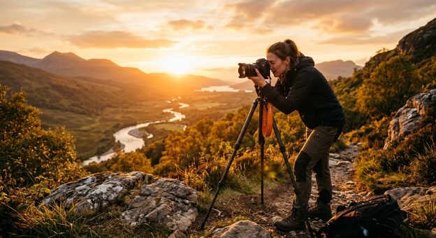
There is a window of time, just after sunrise and just before sunset, when the world looks like it was lit by a cinematographer. The light goes low and warm, shadows stretch long across the ground, and even the most ordinary scene starts to glow. Photographers chase this window for a reason. But showing up at the right time is only part of it. Getting intentional, repeatable results from golden hour light takes preparation, an understanding of how that light actually behaves, and the discipline to have your settings ready before the magic begins.

Golden Hour Essentials

  1. Shoot within 30 minutes of sunrise or sunset when the light is warmest and most directional.
  2. Use a wide aperture and slight underexposure to preserve warm tones without losing highlight detail.
  3. Place your subject at an angle to the light source, not directly front-lit, to create depth and shadow texture.

Why Golden Hour Light Feels So Different From Midday Sun

The quality of golden hour light is not just a matter of color temperature. It is physics working in your favor. When the sun sits close to the horizon, its rays travel through far more of the atmosphere than they do at noon. That longer path scatters out the shorter blue wavelengths and lets the reds, oranges, and yellows push through. The result is that warm, saturated glow that makes skin tones look extraordinary and turns mundane backgrounds into something painterly.

At midday, the sun is nearly overhead. Light falls straight down, shadows pool directly beneath objects, and everything looks flat and harsh. There is no angle to it, no raking quality that reveals texture. At golden hour, that low sun drags light across the scene horizontally. Every surface, every face, every blade of grass gets a three-dimensional quality that midday light simply cannot produce.

This is why portrait photographers, landscape shooters, and street photographers all converge on the same two daily windows. The physics gives you a head start that no amount of post-processing can fully replicate. You can add warmth in Lightroom, but you cannot manufacture the directionality that comes from a sun sitting four degrees above the horizon.

Camera Settings That Actually Work During Golden Hour

Golden hour light changes fast, sometimes dramatically within a span of ten minutes. Having your settings dialed in before the window opens means you are shooting, not fiddling with menus while the best light of the session passes you by.

Start with aperture. For portraits, f/1.8 to f/2.8 gives you subject separation and lets that warm background light bloom softly behind your subject. For landscapes, f/8 to f/11 keeps foreground and background sharp while still letting color saturate the frame. Shutter speed depends on movement. For static landscape work with a tripod, you can go slow. For portraits or any movement, stay above 1/200s. The softer light at golden hour means you need less speed than you might expect, but do not let that tempt you into slow handheld shots without stabilization.

ISO should start as low as possible, 100 or 200 in most conditions. As the light fades toward the end of the window, you may need to push to 400 or 800, but watch your shadow areas carefully for noise. White balance is where a lot of photographers undercut themselves. If you leave it on Auto, your camera will try to neutralize the warmth it sees. Set it manually to Daylight or Cloudy to preserve those golden tones. Shooting in RAW gives you room to adjust in post, but setting it right in-camera means your preview matches reality, which helps you make smarter decisions in the field.

Recommended Settings by Shooting Scenario

Scenario Aperture Shutter Speed ISO White Balance
Portrait (still subject) f/1.8 to f/2.8 1/200s or faster 100 to 200 Daylight
Landscape (tripod) f/8 to f/11 1/30s to 1/125s 100 Cloudy
Backlit portrait f/2.0 to f/2.8 1/250s or faster 100 to 400 Daylight or Manual
Action or movement f/2.8 to f/4 1/500s or faster 200 to 800 Daylight

Metering and Exposure for Warm Tones

Expose for the highlights, not the shadows. If you let the camera meter for darker areas, you will blow the sky and lose all that warm detail. Use spot or center-weighted metering and aim for a slight underexposure, around half a stop to a full stop under the camera’s suggested reading. You can recover shadow detail in editing, but blown highlights are gone. This is especially true when the sun itself appears in the frame, which golden hour rewards generously when the exposure is managed carefully.

How to Position Yourself and Your Subject

Light direction shapes the entire mood of the shot. During golden hour, three main positions are available to you: front lighting with the light behind you, backlit with the subject between you and the light source, and side lighting with the sun at roughly 45 to 90 degrees from your subject.

Front lighting is the most forgiving. The subject is fully lit, exposure is predictable, and colors across the frame are saturated. The tradeoff is flatness. It works well for wide landscape shots where you want color saturation from foreground to horizon, but it rarely produces the most compelling portraits.

Side lighting is where golden hour becomes dramatic. Light raking across a face, a sand dune, or a field of tall grass creates texture and dimension that feels almost sculptural. At a 45-degree angle to the sun, cheekbones, jawlines, and surfaces catch the light differently. The shadows they cast give depth that no editing preset can add after the fact.

Backlit shooting is the most demanding but often the most rewarding approach. Placing your subject between you and the sun creates rim lighting, a warm halo around hair and the edges of clothing. If you expose for the subject’s face, the background often goes luminous in a way that feels intentional rather than overexposed. A reflector or a touch of fill flash balances the foreground without killing the mood of the backlight.

How Seasons and Location Shape Your Golden Hour Window

Golden hour does not follow a fixed clock. The duration and quality of the light shift considerably depending on your latitude and the time of year. Near the equator, golden hour is brief and intense. The sun rises and sets almost vertically, which means it passes through that low-angle sweet spot in a matter of minutes. You might have 20 minutes of usable warm light before the sun climbs too high or drops too fast.

At higher latitudes, especially in summer, the sun takes a much shallower arc across the sky. Golden hour can stretch for over an hour. Parts of Scandinavia in midsummer experience a quality of light that barely changes for two to three hours around sunset. In winter at those same latitudes, the sun stays low all day, which means the entire afternoon can carry golden hour characteristics. That is a genuine gift for photographers who do not want to set a 4 a.m. alarm.

The physical environment shapes the color as well. Coastal areas with moisture in the air produce more diffused, pastel-toned golden hours. Desert environments, with dry and dusty air, tend toward intense, saturated oranges and deep reds. Urban environments scatter the light unpredictably, but reflections off glass buildings and the interplay of warm light against cool shadow can produce shots that feel distinctly urban and powerful in their own right.

Planning Your Morning Sessions Around Sunrise Light

Sunrise golden hour is not just a sunset run in reverse. The light in the morning has a crisper, cooler quality before it warms up fully, and the air is typically cleaner. Crowds are thinner. The scene feels uninterrupted. But it demands considerably more preparation, because you need to be on location, composed, and ready before the light begins to shift.

Scouting your location the day before removes a major variable. Walk the space in the afternoon, note where the sun will rise, and identify foreground elements that will catch the first rays. Think about shadows and how they will stretch away from the rising sun. Planning apps help with exact azimuth angles, but nothing replaces standing in the space and seeing how the terrain relates to the horizon.

For photographers serious about timing their morning sessions precisely, a detailed sunrise photography guide can clarify exact light windows for specific dates and locations, and lays out a scouting process that removes guesswork on the morning of the shoot.

Arrive at least 30 minutes before actual sunrise. The sky begins to lighten well before the sun breaks the horizon, and that pre-dawn blue hour light has its own cool, ethereal quality that pairs beautifully with the warm light that follows. Shooting through the transition from blue hour into golden hour is one of the most rewarding sequences in outdoor photography, particularly with long exposures of still water or open sky.

Using Weather to Your Advantage

A perfectly clear sky at golden hour can look stunning, but it sometimes lacks drama. Broken clouds, incoming fronts, or the aftermath of a passing storm can transform a good session into an exceptional one. Light that punches through gaps in cloud cover creates crepuscular rays, those volumetric beams that appear to radiate outward from the sun, and images from those moments are genuinely difficult to reproduce on any other day.

A forecast showing 30 to 50 percent cloud cover often produces the most dynamic golden hour light. The clouds catch the warm light and reflect it back across the sky, turning the entire horizon into a shifting color field. Rain just before sunset frequently leaves the air clean and the atmosphere charged. If you see clearing on the radar in the late afternoon, that is a strong signal to grab your camera and head out.

What Science Tells You About the Color of Golden Hour

The warmth of golden hour light has a precise physical explanation. The phenomenon is called Rayleigh scattering. When sunlight enters the atmosphere, shorter wavelengths, primarily blue and violet, scatter more readily off air molecules. At midday, this is why the sky looks blue. As the sun drops toward the horizon, its light travels through a far thicker cross-section of atmosphere before reaching your lens. By the time that light arrives, most of the blue has scattered away. What remains is concentrated in the warm red and orange end of the spectrum. NASA’s educational resource on how sky color changes explains this process in depth and connects it directly to why atmospheric conditions have such a strong effect on the quality of golden hour light.

Hazy air carries more particles, which scatter even more blue wavelengths. The result is a softer, more diffused golden hour that can look almost watercolor-like in tone. Dust, wildfire smoke, or high humidity all push the palette further toward orange and deep red. If you photograph in an area with regular atmospheric haze, your golden hours will often produce richer color but softer contrast in the distant background. Factor that into your composition choices and lean into it rather than fighting it.

The Light Waits for No One, But It Rewards Those Who Prepare

Golden hour separates photographers who show up from photographers who prepare. The light builds, peaks, and fades in a rhythm that plays out differently every single day. Two sessions at the same location, one week apart, can look completely different depending on cloud cover, seasonal shift, and whatever the atmosphere happens to be doing that morning or evening.

What makes consistently strong golden hour work possible is not talent. It is a repeatable system. Scout the location ahead of time. Know where the light will come from and how it will fall across the scene. Have your settings ready before the window opens. Understand how the season affects your timing and your color palette. And then stay loose enough to react when the light does something unexpected, because it will.

The photographers who produce the strongest golden hour images are not the ones who stumble onto a beautiful sunset and point a camera at it. They are the ones who built the conditions for a great shot before they ever pressed the shutter. The light is the variable you cannot control. Everything else is preparation.

How to Fix Overexposed and Underexposed Photos After the Shot

How to Fix Overexposed and Underexposed Photos After the Shot

You pressed the shutter. The moment was perfect. But back on your screen, the sky is blown out, or your subject’s face is swallowed in shadow. It happens to every photographer who works in changing light, and it does not mean the photo is ruined. Exposure mistakes in the field are among the most common and, in many cases, most recoverable issues you will face when you sit down to edit.

What Every Photographer Should Know Before Opening an Editor

  • Shooting in RAW gives you significantly more recovery latitude than JPEG, especially for blown highlights
  • The histogram tells you exactly what tonal data was captured or lost before you touch a single slider
  • Automated one-click tools handle batch corrections quickly when manual editing is not practical

What “Clipped” Means and Why It Changes Everything

Every digital photo is made up of pixels. Each pixel holds a tonal value. When a pixel is pushed all the way to pure white from overexposure, or crushed to pure black from underexposure, it loses the detail that was sitting inside it. That is called clipping.

Clipping is the real enemy, not just bad exposure in general. A photo that is slightly underexposed can look muddy, but lifting the shadows in editing often reveals clean detail underneath. A mildly overexposed sky can still hold texture. Heavy clipping across a wide area is different. That tonal information is gone from the file entirely, and no software can invent data that was never recorded.

This is why understanding the principles behind digital image exposure pays off in the editing room. Camera sensors have a finite dynamic range, measured in stops of light. Most modern sensors handle between 12 and 15 stops. Anything outside that window clips, period. Knowing this helps you set realistic expectations before you start dragging sliders.

Reading the Histogram Before You Edit

The histogram is the single most useful tool in any editing workflow. It shows the distribution of tones in your image from pure black on the left to pure white on the right. The height of the curve at any point tells you how many pixels share that tone.

When the histogram slams hard against the right edge, you have overexposed highlights. When it stacks against the left edge, your shadows are clipped. A spike at either end is a warning. It tells you what was lost before you start guessing.

Get into the habit of checking the histogram first. It takes five seconds and saves you from spending ten minutes trying to recover detail that was never captured. If the spike is modest, recovery is likely. If the spike is massive and fat, manage your expectations early.

Fixing an Overexposed Photo Step by Step

Most editing software, whether you use Lightroom, Capture One, or a free alternative like RawTherapee, follows a similar logic for highlight recovery. The order in which you apply adjustments matters more than most beginners realise.

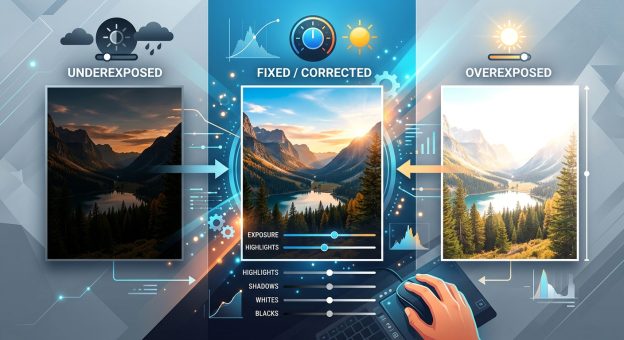
  1. Pull the Highlights slider down first. In Lightroom, this targets the upper-mid tones and bright areas without flattening the whole image. Start at minus 50 and watch what comes back in the preview.
  2. Bring down Whites if the sky or bright surfaces are still blown. The Whites slider handles the very top of the tonal range. Push it into negative territory until texture reappears in the bright areas.
  3. Adjust the Exposure slider last, not first. Dropping overall exposure early flattens your shadows unnecessarily. Work from the top of the tonal range downward for cleaner results.
  4. Check the histogram after each adjustment. Watch the right edge pull away from the wall as you work. That gap means you are actively recovering data, not just shifting the overall look.
  5. Use a graduated or radial filter for sky-specific overexposure. If only a portion of the image is blown, masking keeps your edits targeted and prevents mid-tones from going grey and flat.

RAW vs JPEG: Exposure Recovery at a Glance

Recovery Scenario RAW File JPEG File
1 stop overexposed Full recovery usually possible Partial recovery, may look flat
2 stops overexposed Good recovery with careful editing Limited, clipping visible in bright zones
1 stop underexposed Clean shadow detail after lift Some noise appears when lifted
2 stops underexposed Recoverable with noise reduction applied Heavy noise, colour banding likely
3 or more stops either direction Partial recovery, some detail lost Very limited, visible degradation throughout

Pulling Detail Back from Deep Shadows

Underexposed photos present a different kind of problem. The data is often still there, just compressed into a narrow band at the bottom of the tonal scale. When you lift the Shadows slider, you are spreading that compressed information back out across a wider range.

The challenge is noise. Shadow regions in digital sensors hold the most noise. Lifting them aggressively can turn a dark, moody portrait into something that looks like it was shot through frosted glass. The fix is to balance your shadow lift with noise reduction applied immediately after.

In Lightroom, open the Detail panel after lifting shadows. Raise Luminance Noise Reduction to somewhere between 20 and 40, then check the image at 100 percent zoom. Sharpening can recover some of the texture you lose to noise reduction. It is a trade-off, but most shots come out looking clean if the underexposure was mild to moderate.

For portraits shot in dim light, the face usually holds up well even after a 2-stop lift from a RAW file. Backgrounds, being further from the subject and often deeper in shadow, will show more noise. Targeted masking lets you treat skin separately from the background, giving each region the right amount of lifting without applying a single global correction that compromises both.

Habits That Make Exposure Problems Harder to Fix

Some shooting decisions stack the odds against recovery before you even open your editor. These are common traps:

  • Shooting JPEG only: JPEG applies compression and discards tonal data to keep file sizes small. There is far less information to work with compared to RAW, and clipping appears harsher the moment you push any adjustment slider.
  • Trusting the in-camera LCD preview for exposure: The LCD preview is processed and typically brightened by default on most cameras. A shot that looks correct on the back of the camera can be a stop overexposed in the actual file.
  • Turning off highlight alerts: Most cameras have a blinking highlight warning that flashes on overexposed areas. Disabling it removes a real-time warning during the shoot.
  • Not revisiting exposure settings between scenes: Light shifts constantly during a shoot. Settings that worked inside a venue will blow everything out the moment you step into noon sun.

When Manual Editing Is More Than You Want to Take On

Not every photographer has time to hand-edit every single frame. Wedding photographers, event shooters, and sports photographers come home with hundreds or thousands of images from a single session. Sitting with sliders on each one is simply not realistic when deadlines exist.

This is where automated tools fill a genuine gap in the workflow. Using an image enhancer powered by AI to analyse and correct tonal balance can process a large batch without requiring you to understand every panel in Lightroom or Photoshop. The results are not always perfect for every frame, but for proofing galleries, social media posts, and everyday family photos, they are often more than sufficient.

The approach many working photographers fall back on is a hybrid one. Fix the hero shots manually with full tonal control. Run the rest through a fast automated pass. Spend your limited editing time on the images that will be printed large, shared widely, or delivered as final selects.

How Your File Format Shapes Your Editing Ceiling

RAW files store unprocessed sensor data. That includes all the tonal information the sensor captured, right up to its dynamic range limit. When you open a RAW file in an editor, you are working with the full original data. Nothing has been thrown away yet.

JPEG files are different. The camera applies sharpening, noise reduction, contrast curves, and heavy compression before writing the file. That in-camera processing destroys tonal data in the process. A JPEG that looks fine straight from camera may have no genuine shadow detail left in the dark areas and no texture remaining in the highlights. When you try to correct exposure in a JPEG, you are already working from a degraded starting point.

If your camera supports it, shoot RAW alongside JPEG. Use the JPEG for fast sharing and camera previews. Use the RAW for any frame that deserves proper editing. The difference in recovery capability is significant, as the comparison above shows clearly, and the cost is simply more storage space.

Calibrating Your Screen Before the First Edit

One underrated step in any exposure correction workflow is setting your monitor brightness correctly before you begin. An overly bright monitor makes photos appear less underexposed than they really are. You correct them to look balanced on your screen, share them, then find they look too dark on every other device.

A calibrated display set to a standard brightness, around 100 to 120 candelas per square metre for daytime editing, removes that variable entirely. You do not need a professional colorimeter to get close. Most operating systems have a display calibration assistant built in. Running it takes less than ten minutes and removes a layer of guesswork from every editing session you do afterward.

From Blown Skies to Buried Shadows, Every Shot Deserves a Second Look

No photographer nails exposure perfectly every time. Conditions change faster than camera settings do. A bird lifts from shade into open sky mid-burst. A couple steps from soft indoor light into harsh afternoon sun at the exact moment you press the shutter. These moments cannot wait for manual adjustments. You fire and deal with the light later.

Post-processing exists precisely for this reason. The tools available today are genuinely capable. A photo that looks unusable straight from the camera can often come back to life with careful, deliberate editing. The key is knowing where the recoverable data lives, reading the histogram before reaching for any slider, working the tonal range from highlights down rather than from exposure first, and choosing your file format with recovery in mind long before you ever open the edit panel.

Exposure mistakes are not failures. They are a natural part of shooting in the real world with real, unpredictable light. What you do with them in the editing seat is where the craft carries on.

How to Find and Use Stock Photos That Actually Improve Your Edits

How to Find and Use Stock Photos That Actually Improve Your Edits

Stock photography gets a bad reputation in creative circles. Photographers treat it like a shortcut for people who cannot capture a good original shot. That view is wrong. Used thoughtfully, stock images can transform your editing projects, fill compositional gaps, and give your color grading a stronger foundation to build on. The difference between stock that hurts your work and stock that helps it comes down to one thing: knowing how to choose.

Smart stock photo selection is a skill every serious editor should develop.

  • Composition matching between your stock and original images is the single biggest factor in making composites look convincing.
  • Color grading compatibility saves hours of correction work before you even start the creative process.
  • Knowing where to source curated, editorial-quality stock keeps your licensing decisions clean and your workflow professional.

Why Composition Matching Makes or Breaks a Composite

Grab any two stock images and try to blend them. Chances are the result looks off, even after careful masking and hours of color work. The problem usually starts with composition.

Composition matching means aligning the visual structure of your stock photo with the image you are editing it into. That includes the camera angle, the horizon line, the depth of field, and the perspective of objects in the frame. A background shot with a wide-angle lens will never sit comfortably behind a portrait taken with a telephoto. The geometry simply does not match.

Before you license any image, work through these questions:

  • Does the horizon line in this stock image sit at roughly the same height as in my original shot?
  • Does the light source direction match, or can it be convincingly adjusted in post?
  • Is the depth of field similar enough that the foreground and background do not fight each other visually?
  • Does the lens distortion in the stock image align with the focal length used for my subject?

These questions take thirty seconds to work through. They save you hours of frustration later.

Pay attention to the angle of shadows, too. Shadows reveal the direction and height of the light source at the moment of capture. A composite that blends a subject lit from the left with a background lit from the right immediately reads as fake, no matter how polished the masking is.

Understanding Color Grading Compatibility Before You Download

A good composite lives and dies by color. Two images can have perfect composition and still look like they were shot on different planets if their base color profiles are incompatible.

Look at the raw color temperature, white balance, and tonal range of the stock image before you commit to it. If you are working with golden-hour portraits, you need stock that carries warm shadows and slightly lifted highlights. If your personal image has a cool, flat starting point, you need stock with the same baseline, so your grading touches both images evenly.

Some editing platforms let you extract a histogram or color palette preview before downloading. Use that feature. It tells you immediately whether you are buying a headache or a head start.

Check the dynamic range carefully as well. If your original shot has rich shadow detail, you need a stock image with similar latitude in the darks. A stock image that clips to black in the shadows will create visible seams in your composite that no amount of blending will fix cleanly.

Situations Where Stock Photos Outperform What You Captured Yourself

There is a specific set of situations where licensing a stock image is not just acceptable but genuinely the smarter creative call.

Skies are the most obvious example. Capturing a dramatic, perfectly timed sky requires patience, location access, and luck. A single licensed image of a storm front or a painted sunset can anchor an entire editorial series. The same logic applies to backgrounds that require permits or travel, architectural details you cannot legally photograph for commercial use, and seasonal content you need outside of the actual season.

Texture overlays are another strong use case. Aged paper, concrete, film grain, bokeh overlays, and water surface reflections can all be sourced as stock and layered into your work with blend modes. These are not cheat elements. They are compositional tools that photographers have used since darkroom days, long before digital editing existed.

Environmental elements like fog, rain, light leaks, and lens flares are also candidates. Capturing those in camera under controlled conditions is genuinely difficult. A well-made stock overlay is often indistinguishable from the real thing when applied with restraint.

Where to Source Images That Are Worth Your Editing Time

The quality gap between stock platforms is significant. Low-tier sites push high volumes of generic, over-processed images. Higher-quality platforms curate their libraries carefully, which means fewer results but far better material to work with.

For editorial guidance on licensing decisions and current trends in curated stock imagery, keeping up with a knowledgeable stock photo blog is genuinely worth your time. Coverage of how professionals approach image selection, what licensing terms mean in practice, and how the market for editorial images is shifting makes you a more informed buyer and a smarter creative.

When evaluating a stock platform, look for these indicators of quality:

  1. Contributor vetting. Platforms that review submissions manually tend to have higher technical standards than those relying on automated quality checks alone.
  2. Metadata accuracy. Well-tagged images with accurate color, mood, and subject labels save you real time when filtering search results.
  3. Licensing clarity. The usage rights should be readable without a law degree. If the license page is confusing, the platform is not designed for working professionals.
  4. High-resolution file availability. For compositing work, you want maximum data to edit with. Platforms that compress or resize downloads limit your creative flexibility significantly.
  5. Model and property releases. If your work will be used commercially, you need releases documented. Good platforms flag this clearly on every image listing.

Reading Licensing Terms Without Getting Lost in the Fine Print

Copyright in photography is a real legal area, not an abstract concern. A solid understanding of photography copyright basics matters especially if your edited work will be published commercially, displayed publicly, or sold as prints.

Most stock platforms use one of two main license types. Royalty-free does not mean the image is free. It means you pay once and can use the image multiple times within the defined terms, without additional per-use fees. Rights-managed licenses are more restrictive. They tie the image to a specific use, region, or time period, and the pricing reflects that specificity.

For editorial work like magazine layouts or blog articles, editorial-only licenses restrict you from using the image in advertising or product promotion. That distinction matters. Using an editorial-only image in a commercial campaign is a copyright violation regardless of how much post-processing you applied to it.

Always download the license agreement alongside the image and keep it in your project folder. If a client asks for usage documentation months later, you will have it ready without having to track anything down.

Blending Stock Into Your Work Until It Disappears Into the Edit

The goal of any good composite is invisibility. The viewer should feel the mood, not spot the seam. Achieving that requires a consistent technical approach at every stage of the editing process.

Start with your masking work. A clean, refined mask is the foundation of everything else. Then match the grain and noise profiles of your stock image to your original before beginning any color work. This is the step most editors skip, and it is exactly where composites fall apart. Your camera adds specific noise characteristics at a given ISO setting. Your stock image was shot under entirely different conditions. Unifying the noise structure before color grading keeps the images feeling like they belong in the same frame.

From there, grade both layers together rather than separately. Apply your color adjustments to a merged or smart object layer so the same treatment touches every element in the composition. This creates a unified light that ties stock and original into one cohesive image rather than two images placed near each other.

  • Match the vignette and lens falloff across both images before beginning the grading phase.
  • Use luminosity masks rather than simple selection masks for sky replacements and complex edge transitions.
  • Add a unified film grain or subtle chromatic aberration layer on top of the finished composite to tie everything into one visual texture.

The order matters. Noise, then color, then grain. Work in that sequence and the result will hold together at close inspection.

Your Editing Craft, Expanded by Knowing What to Look For

Stock photography is a tool. Like any tool, it performs well in the right hands and poorly in the wrong ones. Photographers who use stock effectively are not cutting corners. They are making deliberate creative decisions about where their time and skill are best spent.

If you can spend an afternoon on location and capture a perfect sky, do that. But if the project calls for a sky you cannot physically access, a texture that no longer exists in the real world, or a background that would require a location permit and a full crew, then a well-chosen licensed image is the correct answer for the job.

The skills covered here, composition analysis, color compatibility checking, licensing literacy, and technical blending, are not stock photography skills in isolation. They are editing skills. Stock photography simply gives you more material to apply them to, and a broader creative range to draw from.

Build those skills with intention. Spend time on the sourcing process, not just the editing process. Choose images that challenge you technically rather than ones that seem easy to drop in. Stay current on how the industry around stock licensing changes, because the tools and the terms evolve, and staying informed keeps your work legally protected and creatively strong.

How to Find and Use Stock Photos in Your Photography Projects

How to Find and Use Stock Photos in Your Photography Projects

Photography is a craft built on patience, skill, and the right moment. But sometimes the shot you need simply does not exist in your own camera roll. Maybe a client brief calls for a mountain sunrise and you have never left the city. Maybe you are building a photo book and need a wide establishing shot that your personal archive cannot provide. Stock photos were made for exactly these situations, and knowing how to find and use them thoughtfully can meaningfully change the quality of your finished work.

Stock photos are a legitimate creative tool, not a compromise, and photographers who know how to use them produce stronger, more versatile work.

  • Licensing terms govern how you can legally use any stock image, so reading them before downloading is non-negotiable.
  • Resolution and file format determine whether an image holds up in print or large-format display, so check both before committing.
  • Starting your search in the right place saves significant time and filters out low-quality results from the beginning.

When Stock Photos Actually Make Sense for Photographers

There is a widespread assumption that reaching for stock photography signals laziness or limited ability. That assumption is wrong. Professionals across editorial, advertising, and design have built careers around knowing exactly when to use a licensed image and when to produce one from scratch. For photographers specifically, stock images fill gaps that personal shoots simply cannot cover within typical time and budget constraints.

Photo books are a clear example. You might be producing a project that calls for a dramatic aerial coastal shot as a chapter opener, but your entire body of work was shot at street level. One carefully chosen stock image solves that problem without disrupting the visual tone of the whole book. The same principle applies to client presentations. Pitching a visual concept to a client is far more effective when you can show them the look and feel you are aiming for, and stock images serve that purpose.

Portfolio building is another area where stock photography genuinely helps, particularly for beginners. A new photographer with a limited personal archive can use carefully selected stock images, clearly labelled as such, to demonstrate their eye for composition, color, and curation. It shows a client or collaborator what direction your taste runs in, even if you have not yet had the opportunity to shoot everything yourself.

Understanding Photo Licenses Before You Download

Licensing is the part of stock photography that most beginners skip and later regret. Every image on a stock platform comes with terms that define what you can do with it. Ignoring those terms is not just an ethical problem. It is a legal one.

Under U.S. copyright law, photographic works are protected from the moment of their creation. That means every stock image belongs to someone, and the license is the legal mechanism that lets you use it without infringing on that ownership. Different license types give you very different permissions, and confusing them can create real problems.

The License Types You Will Actually Encounter

Royalty-free does not mean free of cost. It means you pay once and can use the image multiple times without paying each time it appears. Rights-managed licenses are priced based on specific usage: where the image will appear, how large, for how long, and in what market. Creative Commons licenses vary considerably, from images that allow almost any use including commercial applications, to those that restrict modification or prohibit commercial purposes entirely.

Reading the license terms takes two or three minutes. Make it a habit every single time, whether the image is free or paid. Small print matters here in a way it rarely does elsewhere in a creative workflow.

Resolution and Format: What Print-Ready Actually Means

Resolution is consistently misunderstood, and that misunderstanding costs photographers real money. For web use, images at 72 PPI look sharp on screen. For print, the industry standard is 300 PPI at the intended output size. An image that appears crisp on your monitor can fall apart completely when printed at A3 or larger.

When selecting stock images for a photo book or any print project, aim for files with dimensions of at least 3000 x 2000 pixels at 300 PPI. Most reputable stock platforms display the full pixel dimensions in the image details before purchase. Check those numbers before paying for anything.

File format deserves your attention too. JPEG files are standard for most uses and serve the majority of situations adequately. If you plan to composite a stock image with other elements in post-production, a TIFF or high-quality layered file gives you considerably more flexibility. Some premium platforms offer these formats at higher pricing tiers, and for complex projects they are often worth the cost.

Where to Start Your Search for Stock Images

The number of stock photo platforms available right now is genuinely staggering. Some are free with a limited selection. Others charge per download or operate on a subscription model that unlocks images within a tier. Each approach suits a different kind of user and a different volume of need.

Before signing up for any paid subscription, take time to browse stock photos from a platform and assess what is actually on offer. Look at how the search tools work, what filter options are available, and whether the style of imagery matches the kind of projects you produce. A few minutes of real browsing tells you far more than reading ten platform reviews written by people with different creative needs than yours.

When assessing any stock library, pay attention to the following:

  • Search and filter tools: can you narrow results by orientation, color tone, subject, and resolution?
  • License transparency: are the terms clearly displayed on each individual image page before download?
  • Style variety: does the library cover the subjects and aesthetics that actually relate to your projects?
  • Format options: can you access high-resolution files without being pushed into a significantly higher-priced tier?

Starting broad and then refining with filters tends to produce better results than very specific keyword searches from the start. Think first about the mood and color palette you need. If your project has a warm, late-afternoon feel throughout, stock images shot in flat overcast light are going to create visual friction no matter how technically strong they are individually.

Making Stock Images Feel Consistent with Your Own Work

Blending stock photography with your own shots is partly technical and partly editorial. The goal is for every image in a project to read as part of the same visual language, regardless of its origin. A few areas are where consistency breaks down most often.

Color grading is the most powerful tool for visual cohesion. If your personal photos carry a warm, slightly faded look, apply a similar treatment to any stock images you include. Lightroom and Capture One both allow you to match the color profile of one image to another with reasonable precision. Free tools like GIMP offer similar functionality. Run this process on every stock image before placing it in a layout.

Beyond color, watch for these common consistency problems:

  • Focal length mismatches: a wide-angle stock shot placed beside tight portrait focal-length images creates an unsettling spatial inconsistency
  • Depth of field differences: shallow-focus personal work clashes with everything-in-focus stock imagery and draws the viewer’s eye to the disconnect
  • Grain and noise levels: if your photos carry visible film grain, a clean, noise-free stock image stands out immediately as foreign
  • Light quality: natural light and artificial studio light have fundamentally different qualities, and mixing them without correction is noticeable even to non-photographers

Portfolios, Presentations, and Being Transparent About Your Sources

If you use stock images in portfolio work or client presentations, the standard practice is to be clear about which images are yours and which are licensed. This is especially important when approaching commercial clients or applying to photography programs. Presenting a stock image as your own original work is a credibility risk with real professional consequences, and the photography industry is smaller than it appears.

Using stock imagery to illustrate a visual concept, fill a gap in a presentation, or establish a mood for a pitch is an entirely different matter and is common practice across the industry. Many working photographers build detailed mood boards from stock images before a shoot begins. It helps clients articulate what they respond to and gives the photographer a visual brief to work toward. Nobody pretends those mood board images are original work. They are reference points, and stock photos serve that purpose exceptionally well in a client context.

For photo books specifically, a carefully chosen stock image used as a chapter opener or background element can strengthen the overall design without feeling forced, provided the image has been edited to sit consistently within the book’s visual style and the usage license covers publication.

Bringing Stock Photography into Your Creative Workflow

The photographers who get the most from stock imagery are the ones who treat it as a deliberate creative choice rather than a last resort. They know exactly when a licensed image serves a project better than a personal shoot would, and they know how to make it sit naturally within their own body of work. That kind of editorial judgment is itself a creative skill, and it develops the more you practice it.

Start with a single current project. Identify one gap where a stock image would genuinely strengthen the result. Search with purpose, check the license carefully, and edit for visual consistency before placing it in your layout. Repeat that process a few times and it becomes part of your standard approach.

The skill is not in knowing which platform has the most images. It is in knowing exactly what you need, reading the terms before downloading, matching the technical requirements of your project, and then making the image look like it was always meant to be there. That is how stock photography becomes a genuine asset rather than an obvious patch.

How to Restore Old Family Photos Using Free and Paid Tools

How to Restore Old Family Photos Using Free and Paid Tools

That shoebox in the closet holds more than old snapshots. It holds first birthdays, summer road trips, and faces of people who shaped who you are. But years in attics and damp basements have taken their toll. Photos crack, yellow, and lose contrast until they barely resemble the moments they once captured. The good news is that restoring them is now something almost anyone can do at home, with the right approach and a little patience.

Photo Restoration: Key Takeaways

  • Scan prints at 600 DPI or higher to capture enough detail for editing
  • Lightroom is a strong starting point for fading, color casts, and low contrast
  • Photoshop gives precise control over scratches, tears, and missing areas
  • AI restoration tools save serious time on complex damage, especially portraits
  • Archiving finished images in multiple formats and locations protects your work long-term

Why Photos Deteriorate and What You Are Actually Working With

Not all old photos age the same way. Black and white prints from the mid-20th century often hold up better than color prints from the 1970s and 1980s. Those color prints used dye-based chemical processes that break down over time, shifting toward warm yellow or muddy magenta as the dyes separate. Humidity, prolonged light exposure, and acidic materials in old albums all accelerate the damage.

Before touching any software, take a close look at the print you have. Fading is the most common issue. Color casts come next. Physical damage like scratches, tears, and water stains requires a different approach than simple tonal corrections. Identifying what type of damage you are dealing with helps you choose the right tools and avoid spending an hour on the wrong problem.

Scanning Your Prints Before Anything Else

Any restoration lives or dies on the quality of the scan. A blurry or low-resolution file cannot be fixed in editing. You need to capture as much information as possible from the physical print before you open any software.

Follow these steps to get a solid scan every time:

  1. Clean the scanner glass with a lint-free microfiber cloth before placing any prints down
  2. Set the resolution to at least 600 DPI for standard prints, and 1200 DPI for small formats like wallet-sized photos
  3. Use the flatbed scanner’s preview function to check alignment before committing to the full scan
  4. Save the original scan as a TIFF file, which preserves maximum image data without compression loss
  5. Store the untouched original file in a separate folder before making any edits, treating it as your safety copy

If you only have a smartphone available, dedicated scanning apps with multi-frame capture and perspective correction can get you started. A proper flatbed scanner will almost always produce a cleaner result for serious restoration work, though. The Library of Congress publishes detailed guidance on digitizing personal and cultural collections, and their recommended practices track closely with what professional photo archivists use in the field.

Getting Started with Lightroom for Fading and Color Issues

Adobe Lightroom is the most accessible paid tool for the early stages of photo restoration. Every edit you make is non-destructive, meaning the original file is never altered. That makes it forgiving and ideal for experimenting without risk.

For faded black and white photos, start in the Basic panel. Pull the highlights down and lift the shadows to reclaim detail at both ends of the tonal range. Increasing Clarity adds back some mid-tone definition without making the image look artificially sharpened. The Tone Curve is useful for older prints where you want to add contrast while keeping the natural softness of the paper texture intact.

For color photos with a strong yellow or magenta shift, head to the White Balance controls first. Adjusting Temperature and Tint often fixes the bulk of a color problem in seconds. After that, use the HSL panel to target specific color channels. Pulling down the saturation on an oversaturated orange channel, for instance, can make skin tones look far more natural without touching the rest of the image.

Lightroom also includes a Healing tool that handles small dust spots and minor blemishes well. For anything larger than a narrow scratch, you will want to move into Photoshop for more precise control.

Using Photoshop to Fix Physical Damage

Photoshop is where the detailed repair work happens. Scratches, tears, and missing corners all require tools that Lightroom does not have. The learning curve is steeper, but the level of control is worth it for photographs that carry real meaning.

The Spot Healing Brush is your first stop for scratches and small marks. It samples the surrounding area automatically and fills in the damage with content that blends in. It works best on areas with consistent texture, like clear sky or a plain studio background. For more complex areas near faces or clothing, switch to the Clone Stamp tool and manually select your source area to get a more accurate result.

For large tears or missing sections, the Content-Aware Fill feature is a genuine time-saver. Select the damaged area with the Lasso tool, then go to Edit and choose Content-Aware Fill. Photoshop analyzes the surrounding image and generates replacement content based on patterns it detects. It is not always perfect on the first pass, but it gives you a strong foundation to refine manually afterward.

Always work on separate layers throughout this process. Keep the original scan on the bottom, and perform all healing and cloning on new layers above it. This preserves every decision and lets you undo specific edits without touching anything else.

Where AI-Assisted Restoration Changes the Equation

Manual editing in Photoshop takes real time. A heavily damaged photo can mean hours of careful work before it looks presentable. That is where AI-based tools have genuinely changed what is possible for people without professional editing experience or a spare afternoon.

AI restoration models are trained on millions of photographs and can recognize facial features, surface textures, and structural patterns far faster than a human can reconstruct them manually. They are particularly strong at recovering facial detail in portraits, smoothing out discoloration across large areas of a print, and filling in missing regions that would otherwise require extensive cloning.

Trying AI photo restoration before paying a professional service makes practical sense for most families. The results have improved dramatically over the past few years, and for many damaged prints, a single AI pass gets you 80 to 90 percent of the way to a finished result. You can then bring the output back into Photoshop for any final manual refinements where the AI fell short.

AI tools do have limits worth knowing about. Fine text, intricate decorative patterns, and complex backgrounds with multiple overlapping subjects can trip them up. For those cases, manual editing still wins. But for faded portraits and standard family snapshots with generalized damage, AI options are hard to argue against for the time they save.

Free Editing Tools Worth Knowing About

Not every restoration project needs a paid subscription. Several free tools handle real workloads without cutting too many corners.

  • GIMP is the most capable free alternative to Photoshop, including clone stamp, healing brush, and curves tools for detailed repair work
  • Darktable functions similarly to Lightroom for non-destructive tonal and color corrections, with a strong processing pipeline
  • RawTherapee offers excellent noise reduction and sharpening, useful for scans that came out slightly soft or grainy
  • Photopea runs entirely in a browser with a Photoshop-style interface and needs no installation or account

Free tools generally require more manual effort and a steeper learning curve than their paid counterparts. But for someone working through a manageable batch of family photos, they cover the essentials without the monthly cost.

Archiving and Printing Your Restored Photos

Finishing the restoration is only half the job. If your restored images live on one hard drive, they are one hardware failure away from being lost all over again.

Save finished restorations in at least two formats. Keep a full-resolution TIFF or layered PSD file as the master copy. Export a high-quality JPEG for sharing and printing. Store copies in at least two physical locations and use a cloud backup service as a third layer of protection. Most major cloud storage platforms offer photo-friendly plans that make this straightforward to maintain.

For printing, a professional photo lab will consistently outperform a home printer for longevity. Home printers use dye-based inks that can fade within a few years under normal light conditions. Pigment-based archival prints from a reputable lab can last for decades under standard display conditions. Ask for archival paper when placing your order, and request UV-resistant coating if the print will be displayed near a window.

Frame choices matter too. Acid-free matting and UV-filtering glass protect prints from two of the leading causes of long-term fading. For photos you plan to display for years, that small additional investment pays off in preservation.

Giving Old Photographs a Future They Deserve

Restoring family photos is one of those projects that starts as a chore and quietly becomes something more. You begin with a cracked, yellowed print and finish with a clear image of someone’s face that might otherwise have faded into nothing. The tools available today, from Lightroom and Photoshop to capable AI options and free editors, make that possible for almost anyone with a scanner and a few focused hours. Start with your best scans, work through the damage methodically, and save your results in multiple places. The photos that survive are the ones worth passing forward.